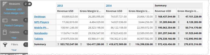
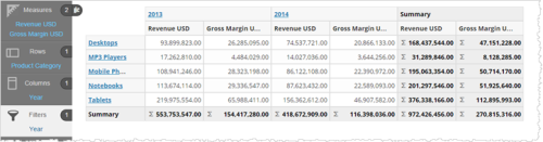
A crosstab is a table made of multiple measures, attributes, and summaries. Also called a pivot table, a crosstab is a concatenation of related, simpler tables. When you add a crosstab to a dashboard, users can sort by rows, columns, or summaries to see the relevant details.
The basic steps for creating and formatting a crosstab are the same as that of a table.
Create a Crosstab
- In Guided
Mode, select crosstab. The Chart Builder prompts you to select the minimum-required two
attributes and one measure.
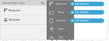
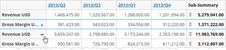
- Add measures and attributes to the table from the Subject Area. Visualizer automatically adds summary and grand
summary data.
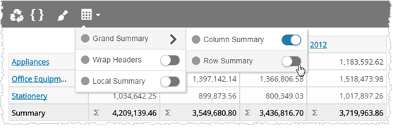
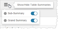
- Click Show/Hide Table Summaries to enable the summaries.
 Tip: You can enable measures between columns and rows.
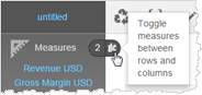
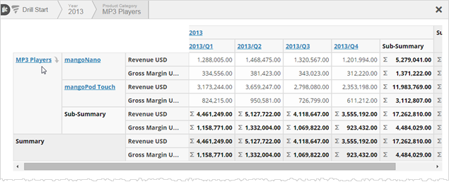
- Click
the hyperlinked attributes to drill down and click the drill breadcrumbs
to drill up.
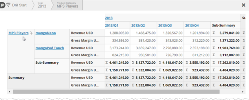
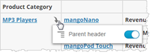
- Click the
down arrow for an attribute to enable the column header to display.
 Tip: For larger crosstabs, you canenable or disable row and grand summaries.
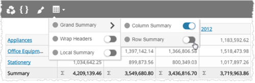
- Click the arrows to sort rows and columns by ascending or descending order.
 Tip: You can also sort an attribute by a measure. When there are multiple measures, Visualizer prompts you to pick one.
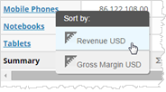
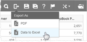
- Click Save.Tip: You can export a crosstab to PDF or Excel.
- Add the crosstab report to a dashboard. Users of the crosstab can also drill, sort, and enable or disable headers.